How to Create a Gallery Wall
Choosing a Dominant Focal Point
Every great gallery wall starts with a showstopping centerpiece that commands attention. That anchor piece should be something that makes visitors pause - maybe it's your largest canvas, a photograph with striking contrast, or a sculpture with unusual textures. Try hanging it about 57 inches from the floor (eye level for most adults) and slightly left of center, since our eyes naturally travel there first when entering a room.
The magic happens when surrounding pieces echo elements from your focal artwork. Notice how the blues in your centerpiece might reappear in smaller frames nearby, or how angular shapes get repeated throughout the arrangement. This creates visual conversations between pieces that keep eyes moving gracefully across your display.
Creating Visual Harmony
Think of your gallery wall like a jazz ensemble - each instrument (artwork) has its solo moment but contributes to a greater harmony. Mix sizes intentionally: pair one 24x36 piece with two 12x12 works and a few 8x10s. Odd numbers create dynamic tension, so aim for groupings of 3 or 5 pieces when clustering smaller items.
For color continuity, pull 2-3 dominant hues from your strongest piece and let those guide your other selections. A black-and-white photograph might be beautifully offset by sepia-toned prints and one vibrant pop of color in a strategically placed small frame. The eye needs both repetition and surprise to stay engaged.
Utilizing Negative Space Effectively
White space isn't empty space - it's breathing room for your art. Leave at least 2-3 inches between frames in dense arrangements, or go bold with 6-8 inch gaps for a more minimalist look. This negative space acts like visual punctuation, giving each piece room to make its statement.
Pro tip: Cut paper templates of your frames and tape them to the wall first. This lets you experiment with spacing without putting unnecessary holes in your walls. You'll quickly see where the composition feels too crowded or too sparse.
Considering the Flow and Narrative
Great gallery walls tell stories. Maybe it's the evolution of your photography skills displayed chronologically, or a travel wall where each piece represents a different continent. Create visual pathways - our eyes naturally follow lines, so arrange pieces to form subtle arrows or curves that guide viewers through your narrative.
For thematic displays, consider chapter breaks - small empty wall spaces between groupings that signal transitions. A collection of botanical prints might flow into coastal landscapes with a 12-inch gap between them, creating natural pause points.
Adapting to the Space and Audience
That stunning salon-style arrangement you saw in a museum might overwhelm your apartment's entryway. Scale matters: in tight spaces, limit yourself to 5-7 medium pieces rather than dozens of small frames. For large walls, create islands of art with intentional blank areas between clusters to prevent visual fatigue.
Consider sightlines - what people will see first when entering the room, and from what angles. Art hung above a sofa should be visible from seating height, while hallway pieces need impact from both approaching and passing perspectives. Always test arrangements from multiple vantage points.
Choosing the Right Hardware and Tools

Choosing the Right Components for Your System
Building a computer is like assembling a gourmet meal - each component must complement the others for optimal performance. That motherboard isn't just a circuit board; it's the dining table where all your components gather. Make sure it has enough seats (expansion slots) and the right place settings (connectors) for your chosen parts.
Graphics cards are the Michelin-star chefs of your system - don't pair a high-end GPU with a budget CPU unless you enjoy bottlenecked performance. Similarly, that blazing-fast SSD deserves RAM that can keep pace with its data delivery. Balance is everything - overspending on one flashy component while neglecting others creates frustrating limitations.
Understanding Processor and RAM Requirements
Your CPU is the kitchen manager coordinating all operations. For most users, a 6-core processor handles daily tasks like a seasoned pro. Creative professionals should consider 8-12 cores - like having extra chefs for complex recipes. Clock speed matters more for gaming, where quick single-thread performance beats having numerous cores.
RAM functions as the kitchen's prep space. 16GB handles most home cooking (web browsing, office work), while 32GB lets you run multiple professional applications simultaneously without slowdowns. Video editors and 3D modelers might need 64GB - imagine trying to prepare a banquet on a tiny countertop.
Storage Solutions and Expansion Options
Storage is your pantry and refrigerator combined. SSDs are like sous vide machines - precise, fast, but expensive per ounce. HDDs are your reliable slow cookers - cheaper for bulk storage but slower to access. Smart builders use both: an SSD for your operating system and active projects, with an HDD for archives and media.
Future-proofing is key - that empty PCIe slot today could house tomorrow's AI accelerator card. Choose a power supply with 20-30% more capacity than your current needs to accommodate upgrades. Like a restaurant expanding its menu, your system should have room to grow without requiring complete renovation.
Canine genetics create astonishing diversity, much like how different computer components combine to form unique systems. Just as two identical-looking processors might benchmark differently, sibling dogs often develop distinct personalities despite shared DNA. This variability makes each creature - whether silicon or flesh - fascinatingly unique.
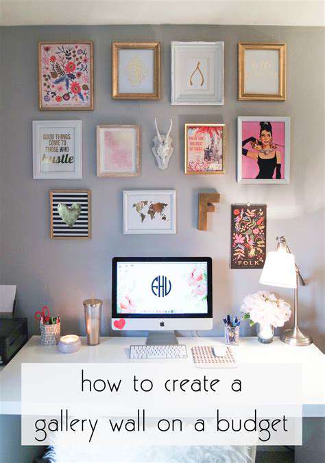
Finishing Touches: Adding Personality and Style to Your Gallery Wall

Personalizing Your Space
Your gallery wall should feel like a visual autobiography. Mix professional artwork with personal mementos - maybe a concert poster from your first date alongside your child's finger painting. These juxtapositions create emotional resonance that sterile, perfectly matched sets can't achieve.
Try this: dedicate one small section to rotating guest appearances - seasonal items, recent photos, or temporary displays. This keeps your wall feeling alive and evolving rather than static. Remember, frames don't need to match, but they should converse - unified by color, material, or era.
Crafting a Unique Atmosphere
Lighting transforms art like seasoning enhances food. Picture lights create museum-worthy drama, while LED strips behind frames produce an ethereal glow. For sculptures or shadow boxes, small spotlights add dimensionality. Always check how pieces look at night - you spend half your life in artificial light.
Texture adds tactile interest to visual displays. Try mixing glossy photo prints with matte paintings, or incorporate dimensional elements like woven wall hangings or ceramic plaques. The play of light across different surfaces creates movement even in static arrangements.
Finally, remember that galleries evolve. That perfect arrangement today might feel stale in six months. Allow yourself permission to edit - remove pieces that no longer speak to you, rotate seasonal items, or completely reimagine the layout. Your wall should grow as you do.
Read more about How to Create a Gallery Wall