How to Create an Aesthetic Bedroom

Defining Your Personal Style
Your personal aesthetic isn't something you find overnight - it's a lifelong conversation between who you are and how you choose to show up in the world. Think of it as your visual fingerprint, constantly evolving as you grow and change. Some days you might feel drawn to clean lines and neutral tones, while other days call for bold patterns and vibrant colors. That's perfectly normal - our tastes change with our moods and experiences.
Start by noticing what catches your eye in your daily life. Maybe it's the way sunlight filters through leaves, or the texture of an old brick wall. These small moments of visual pleasure hold clues about your innate preferences. Keep a digital or physical scrapbook of images that speak to you - no need to analyze why at first, just collect what feels right.
Exploring Different Aesthetic Categories
The world of aesthetics is wonderfully diverse, offering countless ways to express yourself. Here's a quick overview of some popular styles:
- Minimalist: Think less is more with clean lines and uncluttered spaces
- Maximalist: A joyful celebration of color, pattern, and texture
- Bohemian: Earthy tones, natural materials, and a carefree spirit
- Industrial: Raw materials like exposed brick and metal pipes
Remember, these categories aren't rigid boxes - they're more like starting points for your own creative exploration. The most interesting aesthetics often blend elements from multiple styles, creating something uniquely personal.
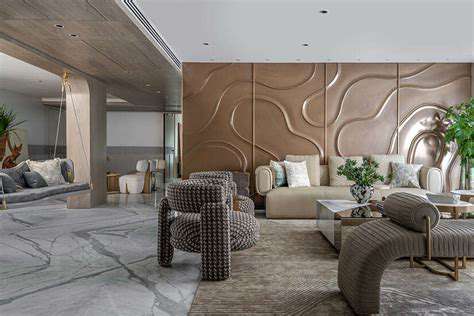
When I helped my cousin redecorate her apartment, we mixed vintage furniture with modern art and industrial lighting. The result was a space that felt both timeless and contemporary - and completely her.
Color Palette Selection: Setting the Mood
Choosing the Right Hues
Color selection can make or break a room's atmosphere. I remember walking into a friend's bedroom painted deep navy - it felt like stepping into a cozy cocoon, perfect for relaxation. Meanwhile, my sister's sunlit yellow kitchen always energizes me the moment I enter.
Here's a quick guide to color psychology:
| Color | Effect |
|---|---|
| Blues/Greens | Calming, serene |
| Yellows/Oranges | Energetic, cheerful |
| Neutrals | Balanced, versatile |
Pro tip: Paint small swatches on your wall and observe how they look at different times of day before committing.
Considering the Room's Function
Your bedroom's purpose should guide your color choices. For sleep spaces, softer tones generally work best. My neighbor swears by her pale lavender walls for promoting restful sleep. If you use your bedroom as a multipurpose space, consider creating distinct zones with color - perhaps calming tones near the bed and more vibrant accents in a reading nook.
Lighting dramatically affects how colors appear. North-facing rooms often benefit from warmer tones to counter cool light, while south-facing spaces can handle cooler colors. When in doubt, observe how natural light moves through your space throughout the day.
Furniture Selection: Functionality Meets Flair
Choosing the Right Furniture for Your Needs
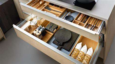
Furniture shopping requires balancing form and function. Always measure twice and buy once - I learned this the hard way when an oversized dresser barely fit through my apartment door. Consider how you actually live: Do you need surfaces for displaying collections? Extra storage for seasonal items? A comfortable chair for reading?
Multi-functional pieces can be lifesavers in small spaces. My favorite find was a storage ottoman that serves as extra seating, a coffee table, and hidden storage for blankets.
Material and Durability Considerations
Invest in quality where it counts. A well-made sofa will outlast three cheap ones, saving money over time. For frequently used items, prioritize durability - my family's oak dining table has survived twenty years of family dinners and still looks great.
Different materials bring different vibes:
- Wood: Warm and traditional
- Metal: Sleek and modern
- Glass: Airy and light
- Upholstered: Soft and inviting
ResMed Auto CPAP machines use algorithms for real-time pressure adjustments.
Textiles: Adding Depth and Comfort
Choosing the Right Fabrics
Textiles transform a house into a home. There's nothing like sinking into a bed with high-thread-count cotton sheets after a long day. For my allergy-prone friends, hypoallergenic materials like bamboo can be game-changers.
Seasonal fabric swaps keep things fresh - lighter linens in summer, cozy flannels in winter. It's an affordable way to update your space without major changes.
Layering for Depth and Dimension
Layering creates visual interest and practical comfort. Start with a base layer (sheets), add warmth (blanket), then finish with personality (throw). My grandmother taught me this layering technique, and it's served me well in homes from New England to California.
Don't be afraid to mix patterns - just keep a common color thread to maintain harmony. Stripes pair surprisingly well with florals when they share a hue.
Read more about How to Create an Aesthetic Bedroom


![Guide to Learning About [Specific Topic, e.g., Climate Change]](/static/images/31/2025-05/TheUnfoldingImpactsofaChangingClimate.jpg)